How to Choose Art for a Neutral Room Without It Feeling Bland
Updated: Apr 24
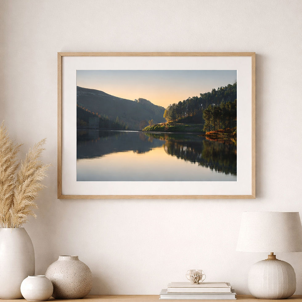
Are you struggling to add personality to your neutral decor?
Do you want something more you, but you're unsure what will fit?
Do you worry that making the wrong choice will turn your elegant peaceful oasis into a shouting match?
Read on for answers and advice that gives you confidence.
Neutral rooms are loved for good reason.
They feel calm, timeless, and easy to live with.
Soft whites, warm creams, stone, sand, taupe, gentle greys, weathered wood, linen, and natural textures can create spaces that breathe rather than shout.
A neutral interior feels restful from the moment you walk into it.
It leaves room for light, texture, shape, and atmosphere to do their quieter work.
And yet neutral rooms can sometimes hover on the edge of feeling a little too safe.
A room can be beautifully restrained and still somehow feel unfinished.
Pleasant, but forgettable.
Elegant, but lacking a pulse.
This is often the point where art becomes essential.
Not as decoration added at the end, but as the thing that brings soul, depth, and personality into the space.
The right artwork can stop a neutral room from fading into the background.
It can create focus, warmth, movement, contrast, memory, or mood, while still preserving everything people love about a quieter interior.
The secret is not necessarily to choose something loud.
It is to choose something alive.
Why neutral rooms need art more than louder spaces?
In a room full of bold colour, patterned furniture, or strong design features, the eye already has plenty to engage with.
In a neutral room, there is often much more visual breathing space.
That can be beautiful, but it also means every element matters more.
Art in a neutral room does several things at once:
it creates a focal point
it adds feeling and individuality
it introduces colour or tonal variation
it stops the room feeling too flat or anonymous
it helps tie together textures and materials
Without art, a neutral room can sometimes feel like a stage set waiting for the main character to arrive.
Art can be that character.
Bland is usually not caused by too little colour, but too little contrast

This is one of the most useful things to remember.
People often think a neutral room feels bland because it needs a bright splash of colour.
Sometimes that is true.
But often the real problem is not lack of colour.
It is lack of contrast, depth, and visual tension.
A room in cream, stone, pale wood, and soft grey may still feel rich and interesting if it has contrast in other ways:
smooth against textured
light against dark
soft against structured
matte against reflective
open space against one strong focal point
Art can provide that contrast beautifully, even if it remains within a relatively gentle palette.
A misty landscape with deep shadow.
A coastal piece with soft sand tones and one area of dark sea blue.
A nature-inspired abstract with layered greys, whites, and hints of teal.
A wildlife print with delicate background tones but a more defined focal subject.
None of these need to be loud to make a room feel complete.
Start by deciding what the room is missing
Before choosing the art, ask a simple question:
✨ What does this room need more of? ✨
Usually the answer is one of the following:
1. More warmth
If the room feels calm but slightly cold, look for artwork with warmth in it:
soft gold
ochre
warm neutrals
sunlit greens
earthy browns
blush or muted terracotta
warm sky tones
These colours can quietly lift a neutral room without disturbing its calm.
2. More depth
If the room feels washed out or flat, choose artwork with stronger tonal contrast:
deeper blues
shadowed greens
dark branches or rock forms
richer layered neutrals
moody skies or water
You don't need vivid colour. You may simply need darker notes.
3. More movement
If the room feels static, look for work with a sense of flow:
sweeping grasses
moving water
mist
birds in flight
gestural abstracts
layered, drifting textures
Movement can wake up a neutral room gently, without making it chaotic.
4. More character
If the room looks elegant but impersonal, choose art with a clearer emotional or narrative pull:
a place with meaning
wildlife with presence
a landscape that feels atmospheric rather than generic
an abstract with a sense of weather, memory, or landscape beneath it
A neutral room often needs not just colour, but identity.
You don't have to match the room exactly
This is one of the most common mistakes.
People often think the art should perfectly match the cushions, the rug, the sofa, and the wall colour.
But if everything matches too neatly, the room can become visually sleepy.
Art should belong in the room without disappearing into it.
That means it is often better to:
echo one or two room tones
introduce one slightly deeper or more interesting accent
keep the overall mood harmonious
allow the artwork to stand out just enough
For example, in a room with cream walls, pale oak, linen upholstery, and soft sage cushions, you might choose a piece that includes:
misty greens
weathered blue-greys
pale stone
one deeper blue-green or charcoal area
That artwork will feel connected, but not blandly matched.
The best kinds of art for neutral interiors
There is no single rule here, but certain types of artwork tend to work especially well in neutral rooms.
Atmospheric landscapes
These are often ideal because they bring depth, distance, and mood into a room without overwhelming it.
Landscapes with mist, water, quiet skies, weathered hills, or subdued coastal tones can give a neutral room a sense of space and inwardness.
They work especially well when the room is aiming for calm, softness, and a connection to nature.
Nature-inspired abstracts
Abstracts in layered neutrals, soft blue-greens, mineral tones, warm whites, or shadowy organic shapes can add sophistication without harshness. They are especially useful when you want the room to feel contemporary but still gentle.
Wildlife or botanical details

These can bring a room to life in a more intimate way, especially if the subject has atmosphere and beauty rather than novelty.
A bird, branch, seed head, or close natural detail can add charm and presence to a quieter room.
Local or meaningful places
Sometimes a neutral room needs emotional grounding more than visual drama.
Art connected to a place you love can do that beautifully.
Meaning brings richness of its own.
Think in terms of tone as much as colour
When choosing art for a neutral room, tone often matters more than hue.
A piece with very pale tones throughout may be beautiful, but if the room is also pale throughout, the effect can become too washed out.
On the other hand, one artwork with a broader tonal range can transform the whole room.
Look for:
light, mid, and dark values within the piece
an area where the eye can rest
an area with enough contrast to create definition
some visual shape or structure, even in soft artwork
A neutral room loves subtlety, but it still needs shape.
Use art to create a focal point
A neutral room can become beautifully grounded by one strong artwork.
This does not have to mean one aggressive or oversized piece.
It simply means choosing a piece that can hold visual attention.
Often that comes from:
scale
contrast
composition
subject
emotional resonance
If a room feels bland, it may be because the eye has nowhere to land.
Art solves that by giving the room a centre of gravity.
A single well-chosen framed print above a sofa, bed, or console can do far more than several smaller decorative objects scattered uncertainly around the room.
Pay attention to frame choice
Frame choice makes a real difference in neutral interiors.
A frame can either sharpen the artwork’s impact or soften it into the room.
Light oak or natural wood
Beautiful for warm neutrals, biophilic interiors, and nature-led spaces. This keeps things soft and organic.
Black frame
Excellent when a neutral room needs more definition or modern contrast.
A black frame can bring a pale room into focus very quickly.
White frame
Works well in airy interiors, but be careful it does not disappear against pale walls unless the artwork itself has enough contrast.
Mounts
A mount can help give the artwork breathing space and quiet importance. In neutral interiors, a soft off-white or pale ivory mount looks elegant and helps the piece feel considered.
One large piece is often better than many timid ones
A neutral room that feels bland is not usually helped by lots of small, hesitant decorations.
A stronger solution might be one larger piece of art with enough presence to anchor the space.
This is especially true:
above a sofa
above a bed
in a hallway
over a console table
in a dining space
in a calm reading corner
A gallery wall can work too, but only if it has intention and enough contrast or variation to avoid turning into background texture.
If your neutral room already feels underpowered, a larger focal piece is often the better choice.
Let texture and subject matter do some of the work
Neutral interiors may be texture-rich, so your art should converse with that.
Linen, boucle, wood grain, plaster, ceramics, woven baskets, stone, and soft rugs all create a tactile setting.
Art that contains a sense of texture, atmosphere, or natural form tends to sit beautifully in that kind of room.
This is why nature-inspired art works so well in many neutral spaces. It brings:
organic shape
irregularity
visual softness
depth
emotional calm
A neutral room can feel beautifully finished when the textures in the room and the textures implied in the artwork begin to echo each other.
Avoid these common mistakes
Choosing art that is too pale for the room
Soft does not have to mean faint. If both the room and the artwork are very low contrast, everything may drift.
Matching too literally
If the art exactly matches every fabric and wall tone, it can feel more like coordination than expression.
Choosing something purely because it is “safe”
Safe choices are often the ones that leave a room without character. Better to choose something calm but distinctive.
Going bold without purpose
Adding a loud piece simply to “fix” blandness can jar if it does not belong to the mood of the room.
Choosing art that is too small
This is a very common reason a room still feels unresolved after art is added.
Read more about choosing the right size artwork here
A better question than “What colour should the art be?”
Instead of asking only what colour the art should be, ask:
What mood do I want this room to have?
What is missing here?
Do I need warmth, depth, softness, contrast, or focus?
Do I want this room to feel airy, grounded, elegant, natural, or quietly dramatic?
What kind of image would I still love living with in six months, or two years?
Those questions lead to much better choices than simply trying to match beige with beige.
The most successful neutral rooms are not empty, but layered
A good neutral room is not colourless. It is layered.
It may contain:
warm and cool neutrals together
natural texture
one or two darker notes
something old or irregular
a sense of life
and art that gives the room feeling
That final layer is what turns a nice room into a memorable one.
Art does not need to fight a neutral interior in order to save it from blandness.
It simply needs to bring enough presence, depth, and truth to keep the room from falling asleep.
Sometimes that will be a soft landscape with shadowed hills and pale light.
Sometimes a nature-inspired abstract in mineral tones.
Sometimes a quiet wildlife piece full of detail and watchfulness.
Sometimes a place that matters to you more than any trend ever could.
The point is not to make the room louder.
It is to make it more alive.
More Art for your home inspiration
Are you looking for art to complement a neutral interior?
Feel free to browse these collections


I’m really enjoying this series. It’s making me examine what is working and not working … especially when it comes to what is hanging on our walls.
Such a thoughtful take on neutral spaces. I love the idea that the issue isn’t lack of color, but lack of contrast and “life.” That really reframed things for me.
Loving this series you have created on decorating with art. Art is so personal and we need to love the art we surround ourselves with.
I appreciate your tips on how to choose art for a neutral room to make it vibrant.